Animated React components
you own.
34 animated components and sections for shadcn, every one with a Customize panel. One command copies the source into your project, and 29 of them need no package at all.
$
Hover the card — the light follows you.
Latest release
New in the catalog
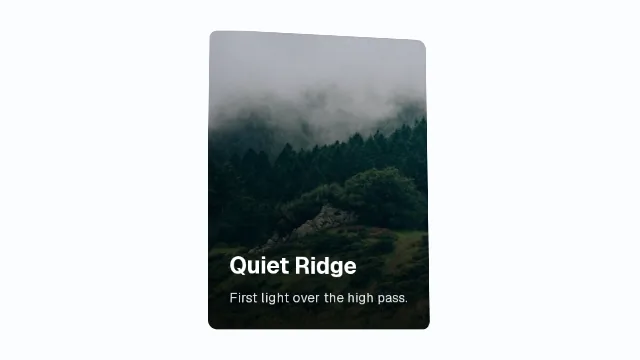
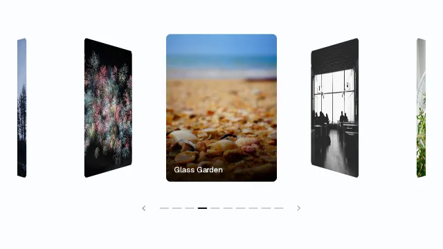
The newest pieces, each filmed from its own demo. Hover a card to see it move; open it for the live preview, its Customize panel and the install command.
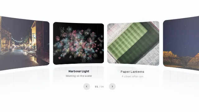
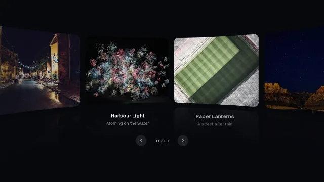
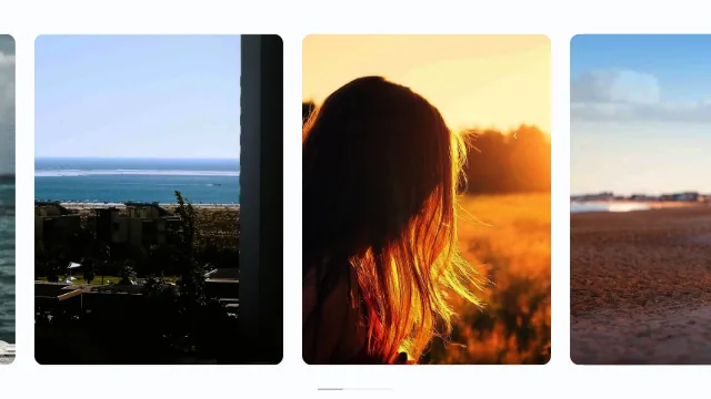
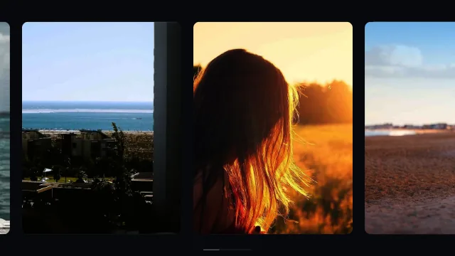
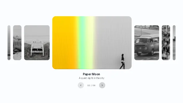
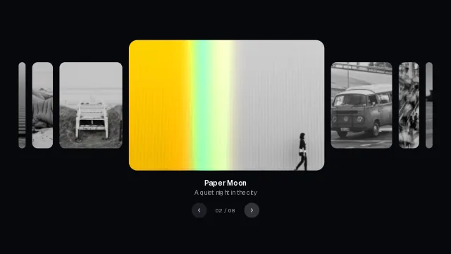
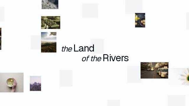
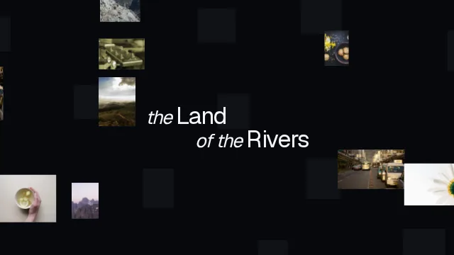




Live
See them in action
Real components running on this page, as they would in yours. Move the pointer over them.
Grainient
Move the pointer to stir it. Click to swirl.
Paper Lanterns
Juniper Hale
On every component page
Customize every piece before you install it.
Under each preview sits a Customize panel with a control for every prop that changes how the piece looks or moves. Drag a slider and the preview answers at once; the usage snippet follows, ready to paste.
- Sliders, selects, switches, text fields and a full colour picker, one row per prop.
- The values live in the address, so a customised look is a link you can send.
- Preview at desktop, tablet and phone widths, or drag the handle to any width.
- The Code tab writes the usage with your values; backgrounds open in the Studio with them.
Customize
import { TextShimmer } from "@/components/ui/text-shimmer"

<TextShimmer>Shimmering text</TextShimmer>
Sites
Sites built with mewo
Whole pages made from the pieces in this library, framed here at a desktop, tablet or phone window so you can scroll them as a visitor would. Turn on Inspect and the site outlines the piece under your pointer and names it: a click selects it in the panel beside the frame, a double-click opens its page with the install command. The simple pieces a site needs ship too, unlisted: each has a page and installs like any item, but stays out of the catalog. And every piece's page says which sites it is seen in.
Background Studio
Tune a background live, then take it with you.
The Studio puts any of the library's backgrounds on a stage. Pick a preset, move the controls and watch it answer; lay a page over it to see it at work. Try it below, then open the real thing with the same settings.
Open the Studio- Presets to start from, then a control for every prop, with undo for every change.
- Sample content over the stage, a landing page, a phone or a card, to judge the background with real text on it.
- Export the code, a PNG at any size or a looping video, rendered frame by frame so the file is exact on any machine.
- The address is the document: copy the link, and the exact look comes back.
One command, and the code is yours.
The shadcn CLI copies the component's source into your Next.js, Vite or React Router project. No wrapper library, no runtime dependency on mewo, nothing to lock you in.
Installation guide$ npx shadcn@latest add @mewo/text-shimmer
✔ Checking registry.
✔ Created 1 file:
- components/ui/text-shimmer.tsx
The library
What's inside
A shadcn registry of components and page sections, the whole sites they build, and the tools to tune them. Everything installs with one command and lands in your project as source.
34 components and sections
Text effects, carousels, scroll scenes, cards, backgrounds and full page sections — the parts you would otherwise build from scratch.
Browse the catalog- Text Shimmernothing
- Split Textmotion
- Dream Catogl
- Glass Panel@base-ui/react
Only what it needs
Each item installs just the packages it uses: Motion, a WebGL library, or nothing at all.
Well organized
5 clear categories, from text effects to whole page sections.
prefers-reduced-motion: no-preference
prefers-reduced-motion: reduce
Reduced motion, built in
Every item checks prefers-reduced-motion and settles into a still, readable state.
components/ui
- split-text.tsx
- spotlight-card.tsx
- text-shimmer.tsx
Yours to edit
The CLI copies the source into your project. No wrapper library to lock you in.
- Flow0.8
- Speed1
- Grain8%
- Silk0.35
Background Studio
Tune any background live, drop sample content over it, then export the code, a PNG or a video. The link reproduces the exact look.
Open the studio